Welcome

Welcome to video tutorials, a place which will provide you with simple and easy lessons concerning graphic design, photography, audio engineering, production, animation... Here, you can find tutorials on these subjects showing you how, in easy way, you can create what you want, with no trouble at all. There are new tutorials added every day! Hope you find these lessons useful!

Wednesday, October 22, 2008

Shopping girl in a blue town

In this step-by-step tutorial, a will show you how to create modern and practical transparent animation. You can use this animation in some presentation, banner, or on some web site. This animation is simple, and you will not have any need for Action Scripting.

Step 1

Create nwe flash document. Press Ctrl + J on your keyboard (Document Properties) and set the weidth of your document to 450px, and height to 300px. Select any color for your background. Set any color for your background. Set Frame rate to 28fps.


Step 2

Take the picture from:
http://www.addlimb.org/kovac/picture1.jpg
Import the picture by: Go to File > Import > Import to stage (Shortcut key: Ctrl+R) > picture1.jpg (picture of blue town)


Step 3

Picture is currently selected, so go to Align Panel (Ctrl+K) and do the following:
1. Check if Align/Distribute to Stage button is off.
2. Click on Align horisontal center button.
3. Click on Align vertical center button.

Step 4

Picture is still selected, press F8 (Convert to Symbol) to make this picture a Moviea Clip symbol


Step 5

Now, go to frame 20, 120, 140, and press F6 on each frame


Step 6

On frame 140, picture is still selected, if you ahve lost your selection, choose Selection Tool (V), anc click on the picture to select it. After that, go to Properties Panel (Ctrl+F3). On your right side, you will see color menu. Choose Advanced, and click on Settings button, and put these aprameters and click ok.

Do this for the first frame also.

Step 7

Double-click on the name of the layer1, and change it to "Town"

Step 8

Create Motion Tween between frames 1 and 20, and frames 120 and 140

Step 9

Now, create new layer above layer Town, and call it Girl


Step 10

Take the picture from: http://www.addlimb.org/kovac/picture2.png
Now click on frame 20 on layer Girl, and press F6. You are still on frame 20 of the layer Girl. Go to File > Import > Import to stage > picture2.png


Step 11

Picture is still selected. Preess F8 (Convert to Symbol) to change the picture into Movie Clip Symbol.

Step 12

Now click on frame 30, 35 i 40 and press F6 on each frame

Step 13

Go back to frame 20 and set picture to this position:

Step 14

Take the Selection Tool (V) and click on the picture. After that, select the filters tab, click on "plus" icon, and select Blur filter and set following values:


Step 15

Select frame 30 and set picture in the position as I did

Do the same thing with the frames 35 and 40

Step 16

Go back to frame 30, take Free Transform Tool (Q) and zoom in the picture

Step 17

Take Selection Tool (V) and click on the picture to select it. After that go to Properties Panel (Ctrl+F3), you'll see color menu. Choose Tint, and set following values:

Now, you'll get this picture:

Step 18

Select frame 40, again, take Selection Tool (V) and click onece on the picture to select it. Select Filter tab and click plus icon and choose Glow filter, and set these values:


Step 19

Create Motion Tween between frames 20 and 30, frames 30 and 35 and frames 35 i 40


Step 20

Click once on frame 110, and press F6 six times


Step 21

Click on frames 111, 113 i 155 and press Delete button on your keyboard. As shown on picture:

Step 22

Click on frame 120, and press F6


Step 23

You are still on frame 120, set the picture as shown on picture


Step 24

After that take Selection Tool (V) and click on the picture once, select filters tab, click on the plus icon, and take Blur filter, and set these parameters:


Step 25

Create Motion Tween between frames 115 and 120


And we'r done!


Test your animation, and enjoy


End result:

Tuesday, October 21, 2008

Creating 3D box for applications, products...

In this tutorial, i will show you how to make 3D box for an application (or any product), by using Photoshop. The technique is very simple, and the result can be astonishing, and very creative. Before we start making this box, it would be usefull to make a picture that presents sides of our box.


Step 1:
Remember that while you create pages of your box (their apperance), do them separatly, and, in the end, put them side by side, as shown on picture.


Step 2:
Now we will bend the sides, so we get 3D effect. First, take care to group or merge all layers of one page of the box. It's important to do with one object. When you have selected front side of this 3D box, choose "Move tool", and make "Show Transform Controls" on, as shown on picture.


In the end, you should get the front side that is marked like this:


Now the improtant part comes. While you hold Ctrl+Alt+Shift, with your mouse click on the upper right corner, and slowly draw downwards. By holding these commands, you'll make both pages (upper right, and lower right) move simultainosly. Experiment while you don't get the right angle...
The result should be as follows:


When we have done this effect, we eill notice that this front page is little more streched than we want it to be (it spoils 3D effect). We will narrow it by doing this:
Choose option Transform -> Scale , and while holding middle right pad (square that allows you to click on it and draw left-right) draw it little to the middle. Effect that we want to achieve is this:


Step 3:
When we have finished this, we can freely say that we have finished with the front side. Repeat the same technique on the side also. How to move it, and on what angle..it all depends on your imagination.. If you can not see in advance how it should look, take standard box, and look on what angle the edges are..
End look is like this:


The box is over!
What we are left to do is polishing, to make it look more cool.
Step 4:
We will do several steps to make this box shiny. First we will do is make a stand. The stand is going to be gradient that you can see on the following picture:


We do this in a following way...
First, choose two colors in toolbox, one gray (the background color), and the other is a bit lighter compared to first color. When you have set that, create new layer on top of the project. Then choose "Gradient tool" from toolbox. After that, create one gradietn object on the new layer. Draw from horisontal middle towards the edges to get one gradient circle. Then, cimply select upper half (from vertical half of the circle upwards) and delete that part.
In the end, all you need to do is to set created layer so it stands between background and box.
All that should approximate the picture showen above.

Step 5:
In the following steps we will show you how to make shining on our 3D box. For the start it would be usefull to make duplicate of two sides of your box. When you have made duplicates, selct them and do:
Edit -> Transform -> Flip Vertical
After that, move those parts below our 3D box, so that edges of our 3D box, and it's reflection touch as on the picture below.


Now, by using Edit > Transofrm > Skew we will set that each side of this reflection is completly in touch with the edges of 3D box. So, select one side, choose this option, and move those edges that do not touch the edges of the 3D box. When you do that on both sides, reduce their opacity to 50%...
And the result should be....


On this picture, you also see that lower part of the reflection dissapears.. I did that by using opacity Layer mask.

That is it.
Experiment a bit with different perspectives of the box, so as to see what else you can get.

Saturday, August 18, 2007

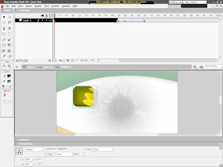
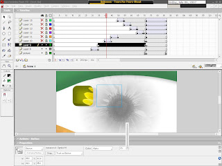
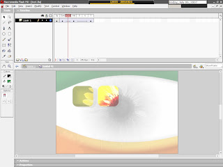
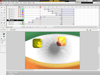
- Macromedia Flash - Sunflower presentation (button effects)

Flash can be, among other things, be used for very effective creation of interesting effects, that can be modified in web design. Button effects are among top ones. In this lesson, we will go across few basic ones. They can be used later, as the basic for more complicated animations...

This, very detailed lesson, has many useful "by-the-way" tips, that will give better understanding of todays topic, and is concerning many nice techniques in each step. I also included whole screenshots in this lesson, as to help you not to get lost.
Final result will be mixed presentation of many things you can do with knowledge of todays lesson!

Here's the result:


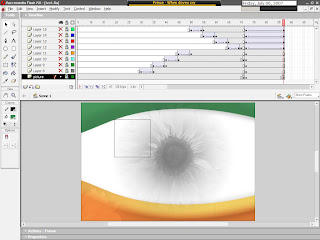
1. Let me start with saying, that for creating nice buttons you will need some basic knowledge of graphic design... But, as this is only the beginning, let's see what we can do on our own.. First, there is drawing of buttons.
On of easiest ways, and at the same time mostly used ones is separating parts of the picture from it's background on which the button will lay. You can do this part with programs like Photoshop, Gimp, Freehand... just to name a few... You can't do this with success in the Flash itself!
So, for the start, you will need finished graphics!


2. As said, start by separating part of the picture from it's background, and with play a little with the part you cut (separated) from background... (some tips: try changing colors, sharpness...)
All this will change the look of your button-to-be, make it stand out, and that is the first step in creating a button!
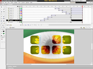
(Buttons on this picture are made from two copies of one graphics. To the one on the bottom, i removed all colorit, and the ratio of black and white color is changed! Buttons are cut from original part of picture with color kept, and size changes!)


3. Now, with the graphics in place, we can deal with basics of button interaction in presentation. Small animation of "entering" of buttons can visually enrich the presentation, and it is easy for making. In this case, button is entering from top left corner. Animation is 5 frames long, so it is smooth...
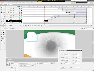
Just for the aesthetics, you can also add the effects that concern colour. In this case, button is on it's first frame completely white, and, while it is set to place, it gradually get's it's own colour. Animation is also 5 frames long. In this step, graphics are converted into movie clip!


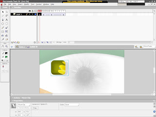
4. Button has 4 main states: Up, Over, Down, and Hit! Each responds to the relation of mous and button (the name of the state speaks for itself). It is needed to have graphics for each and every one of four stated states (it is recommanded to have small changing of place [few pixels] for each one, just to have better feeling of control to the button user).
You can also create animation, but if you want to create something functional, it is not recommanded to create buttons that fly around and can't be clicked on!


5. While we are "in" the button, or in "edit" state, graphic can further be converted and animated, so that button get's effects of animation even though there is no interacion to it! The animation mostly used is about colour and effects concerning colour. In this example, button stands still for 48 frames, and then, in next 18 frames, amount of it's colour is increased, so you get effect of periodical shining of button - independently of users interaction with it!


6. One more basic effect frequently used, easy to apply, (and in combination with others gives interesting look to buttons), is Alha feature of converted graphics. Invisible button!
We will add Alpha feature to converted graphics, in Properties, and apply value 0 to it!


7. In edit space, in states Over, Down and Hit, we will import graphics withouth Alpha feature. We will, for now, leave "Up" empty. This will give the apperance of "invisible" button, that visually won't be in presentation, but will be usable for the ones that know it's location! Something like 'secret button'...


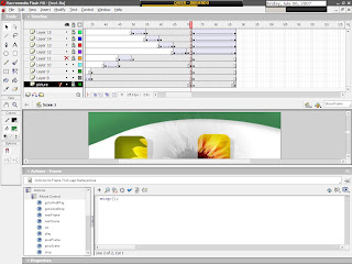
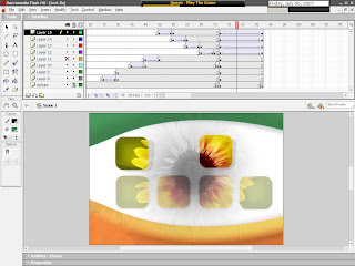
8. In this example, we will deal with basic controls of presentation, or clip, with buttons. With the help of one visible button, we will start animation that will show 4 buttons not to be seen in the start.
We will create one simple button with four basic states (right button on the picture). In the bottom rowe, we will put four graphics with feature Alpha set to 0.


9. You need to stop the clip before it ends. On 71st frame, in background layer, Keyframe is set, and in it, with the help of action script, Stop command (from the Movie Control group of command) is set.


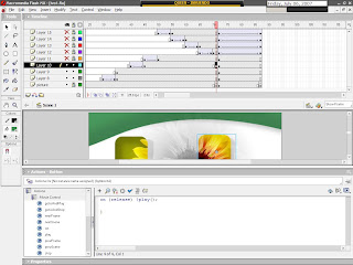
10. On the same 71st frame, but in the layer of control button, command " on(release){play();} " is set, again, with the help of action script.


11. Lower row of the button is animated in that way as to gradually become visible in 14 frames, again, by using Alpha feature. On the first frame, it's value is 0, on the last one it is 100. This animation won't start by itself, because of stop command. It will only be started by clicking on the button with command " on(release){play();} ", so you will get effect of graduall appearing of the remaining buttons. This can be usefull in creating Vista-like menus, and similar effects...


With this step I conclude todays lesson...
Again, you can veiw today's lesson's work on the page: http://www.addlimb.org/kovac/cvet.html

Hope you had a good time, and looking forward to feedback!

- Macromedia Flash - Transparent objects

Here is easy way to make transparent object in Flash in two ways!
You can copy final ".fla" file of this lesson from: http://www.addlimb.org/kovac/transparent_santa.fla


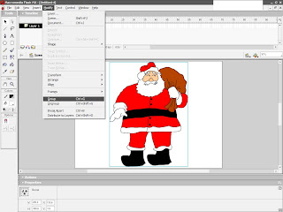
1. Group earlyer prepared drawings. Mark all parts of object, in options go to Modify, option Group in drop down menu. (or use shortcut Ctrl+G)


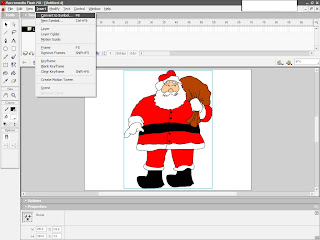
2. You need to convert this group in movie clip. Mark the group, option Insert, then Convert to symbol. (you can use shortcut F8)


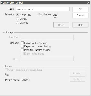
3. In options window enter the name for new symbol. In my case: "movie_clip_santa". In option Behaviour choose Movie Clip.


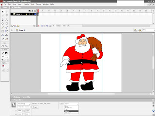
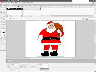
4. Select thus made clip. In Properties click on drop down menu and select Alpha.


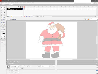
5. Transparency level is determined by value 0-100 which is about Alpha feature of Movie Clip. Higher value = higher transparency.


In this way, Flash object is given transparency that can later be modified. But, if you want to achieve effect of gradual transparency, you need to use little animation...


(steps 1-3 are repeated, and then:)

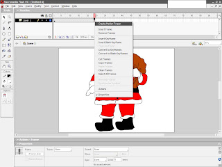
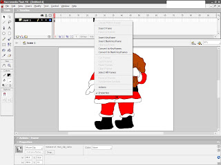
6. With right click we will set frame on timeline, with option from drop down menu Insert Frame/


7. Again, with the right click, now on inserted frame, we will make motion tween with option Create Motion Tween, from drop down menu.


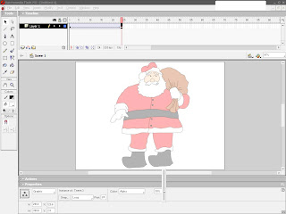
8. While still remaning on the last frame of animation, we will select object and in properties of objects select option Alpha.


9. As earlier statedm values are as on picture in field near options.


Alpha determines level of transparency of object, where o is total transparency (object is not seen), and 100 complete visibility.


There it is! That was easy!

Thursday, July 5, 2007

- Photoshop - Create Pineapple

Here's how you can create virtual Pineapple with just few steps...


1. Open up a new image any size and create a black circle;


2. Use the gradient tool, and create circular gradient with the colors #EADF87 and #DBBF43;


3. Create a new layer and fill it with black color.
Now go to "Filter -> Noise -> Add Noise" and put the slider to the maximum (400%)


4. Now add "Filter -> Blur -> Radial Blur" and set it to zoom and 100%;
Set it to overlay and press CTRL+G;


5. Now, delete a circle in the middle;


6. Select the Move-Tool and duplicate the pinapple-layer; Now while holding ALT, move the layer down.


7. Now press CTRL+U to darken, set saturation to about -47, lightness to -32, and it's finished!


There's Pinapple!